The Express has brought you abroad beforecarInterpretation of the meaning of the brand's car logo, netizens said that the editor does not write domestically produced. In fact, I said at the beginning that the second article is about domestically produced. Today, the editor of Express News will bring you the latest and complete interpretation of domestically-made brand car logos, which is unique. , You will never find anything newer or more complete than this one.
auspicious
The meaning of Geely's old car logo is: the ellipse symbolizes the earth, which means facing the world and going international; the ellipse is the most stable in the dynamic, indicating and wishing Geely's career as stable as a rock, standing in the wind and rain.
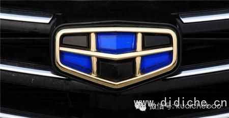
Geely’s new logo is based on the Emgrand Logo and incorporates the blue of the original Geely Logo, and this shape is inspired by "healthy men’s six-pack abs."
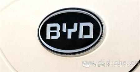
The BYD LOGO in 2007 has been replaced from the old blue sky and white cloud logo with only three letters and an ellipse. BYD means build your dreams, that is, to achieve dreams. Many netizens expressed dissatisfaction with this logo.
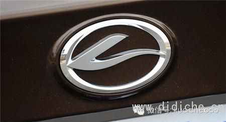
The Southeast car logo is designed with "Peng Bird" as its shape. The overall shape of "Peng Bird" is composed of the changing initials of "SOUTH" and "EAST", which means Southeast Motor. The head shape design of "Pengniao" is from the southeast with its head up, showing the momentum of flapping its wings, and the corporate philosophy and ambition of "peng the southeast and travel all over the world".
Changan
The predecessor of Changan Automobile can be traced back to the Shanghai Ocean Artillery Bureau founded by Li Hongzhang in Songjiang, Shanghai in 1862. The old logo of Changan Automobile is a shield and a spear, meaning to increase speed while ensuring safety. The new car logo adopts the "V" shape, which means "victory (success)" and "value".
red flag
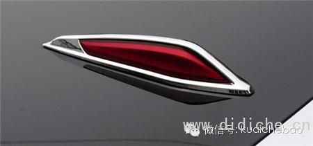
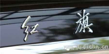
Red flag car logos include front car logos, rear car logos and side car logos. The front car logo is a red flag. It goes without saying that it represents Mao Zedong Thought; the rear car logo is the two Chinese characters "Red Flag", which is the inscription on the cover of the "Red Flag" magazine founded by Mao Zedong in May 1958. The earliest CA72 was marked with five small red flags side by side on one side of the fender, representing the workers, peasants, commerce, and soldiers.
SAIC Roewe
The name of Roewe ROEWE is derived from "innovation honor, prestige everywhere", and the English name "Roewe" is derived from the German root Loewe (lion). In the middle of the pattern is a Chinese watch guarded by two lions. The symbol painted with modern techniques under the pattern is a fusion of the letters "RW", which is the abbreviation of the brand name. At the same time, "RW" also stands for lion in Ancient Egyptian.
SAIC MG
The full name of MG is Morris Garages (Chinese: Morris Depot), which is a car dealership founded and sold by British William Morris. In 1923, the octagonal MG logo appeared on the car body.
Nanjing Automobile bought MG in 2005 and named it Nanqi MG Automobile Co., Ltd., and rolled off the first domestically-made MG car in 2007. At the end of 2007, the more powerful SAIC acquired Nanjing Automobile, and MG finally belonged to SAIC. Finally, after 12 generations of turbulence, the MG6 became the first model to be reborn.
FAW
The core element of China FAW's visual identification system is based on the "1" character as the visual center. The word "qi" constitutes the shape of an eagle spreading its wings.
Guangzhou Automobile
Guangzhou Automobile Group Co., Ltd. (referred to as GAC Group) was founded on June 28, 2005. In 2010, the new GAC Group logo designed by a domestic design company was officially launched. The new logo "G" is the abbreviation of GAC Group. "The first letter.
GAC Gonow
Gonow was founded in 2003 and mainly produces pickup trucks and SUVs. On April 26, 2010, Gonow Group and GAC Group formally reached a strategic cooperation and established a joint venture company. Gonow’s car logo G is the initial letter of the English name Gonow. It looks like the car logo is really two brothers to GAC. Gonow’s slogan is "Gonow Let's gonow".
Changfeng Cheetah
The logo of Changfeng is a deformed cheetah head. Hunan Changfeng Automobile Manufacturing Co., Ltd. has introduced the product technology of Mitsubishi Pajero V31, V33, and Pajero io to produce a cheetah series that is suitable for Chinese road conditions and has strong market competitiveness. product. Therefore, Changfeng uses a deformed cheetah head as its symbol.
Dongfeng
Dongfeng Motor, formerly known as China's Second Automobile Manufacturing Plant, uses artistic deformation techniques for its logo, taking the scissor-shaped tail feathers of swallows flying in the sky as the pattern basis. The main meaning is Shuangyan dance east wind. The word "two" of the Second Automobile Group implies double swallows. At the same time, it also symbolizes that the wheels of Dongfeng Motor will roll forward and never stop, rushing out of Asia to the world.
Brilliance China
Brilliance Zhonghua is a car sub-brand of Brilliance Automobile Group. The car logo is composed of the Chinese character "中". The font is a Chinese character evolved from Xiaozhuan, and its shape is like a gold cup, because Brilliance Zhonghua and Brilliance Jinbei belong to the Brilliance Group.
Haima Motor
The logo of Haima Motor is an abstract eagle-falcon shape embedded on a circle that symbolizes the sun, which means "the rising sun is rising, Kunpeng spreads its wings", which represents the corporate image of Haima Motor that is striving for progress and is determined to take off.
Hippocampus Zhengzhou
In 2007, Haima established Haima Zhengzhou Automobile Co., Ltd., which is mainly engaged in the research and development, production and sales of mini passenger vehicles and commercial vehicles. "Hippocampus Zhengzhou" car logo means "heaven and earth circle".
Lifan
Lifan Group is one of the largest private enterprises in China, established in 1992. At a glance, the logo of Lifan Motors is similar to that of Buick. In the logo of Lifan Motors, there are three L lines next to each other. The simple understanding is to symbolize unity and cooperation.
Land breeze
Landwind Motors was established in November 2004 by the cooperation of Changan and Jiangling. The Landwind Motor brand focuses on the development of off-road vehicles and strives to become a professional off-road vehicle brand in the industry.
Lufeng’s new LOGO has removed the red diamond-shaped background of the original LOGO, and the letter "L" has a stylish chrome design.
Zotye
Zotye Automobile was founded in 2003, and the newly launched new logo is composed of a concise and clear "Z". Z is the English initials of Zotye Automobile.
Youth lotus
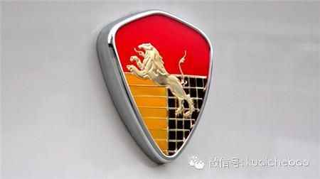
Youth Lotus is a passenger car brand owned by the Youth Automobile Group. The logo is in the shape of a shield with a lively little lion inside.
Hafei
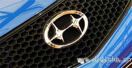
Hafei’s new car logo means that two stars are connected, showing that Hafei and Dong’an are strategically integrated with locomotives and strong forces. The stars reflect each other. It also implies the aviation background of Hafei Dong’an in the past and showcases the beautiful milestones of the future.
Huatai
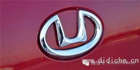
The interior of the Huatai logo is a square U, and the exterior is surrounded by an ellipse, forming a shape of an outer circle and an inner square, expressing the environmental protection concept of Huatai Automobile's "Harmony of Nature and Man".



 Email: